
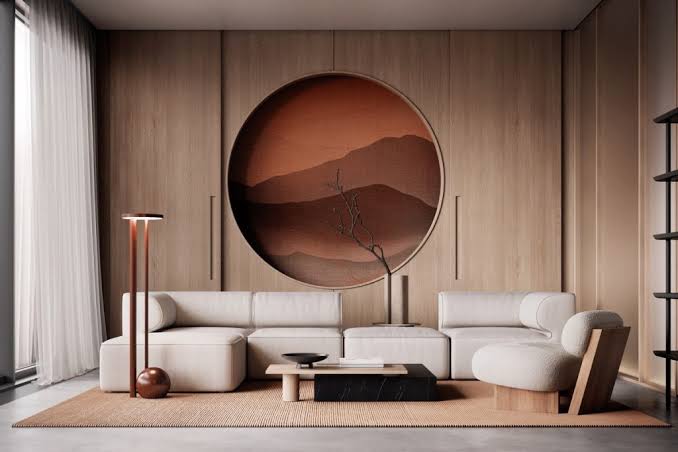

The Design Aesthetic That’s More Specific Than It Looks
Japandi — the aesthetic fusion of Japanese and Scandinavian design principles — has become one of the most searched and imitated residential design styles of the early 2020s. Its appeal is clear: the visual result is calm, restrained, and beautiful in a way that photographs exceptionally well and translates easily to actual living environments. Its challenge is equally clear: ‘Japandi’ is often applied loosely to any interior featuring beige tones and minimal clutter, which misses the specific design principles that produce the genuinely distinctive result.
Understanding the underlying philosophies — wabi-sabi (Japanese) and hygge/lagom (Scandinavian) — produces design decisions that create the authentic aesthetic rather than a loose approximation.
The Shared Philosophy: Imperfection, Function, and Restraint
Japanese wabi-sabi is the aesthetic appreciation of imperfection, transience, and incompleteness — the beauty of things that are worn, irregular, natural, and impermanent. Wabi-sabi is why a hand-thrown ceramic bowl with uneven glaze is more beautiful in this aesthetic than a machine-perfect one, and why aged wood with grain and texture is preferred over a smooth, uniform veneer.
Scandinavian design principles emphasize functional beauty — objects that serve a purpose beautifully, craftsmanship that prioritizes usability, and a democratic design sensibility. The overlap between these two traditions is in their shared rejection of excess ornamentation, their respect for natural materials, and their prioritization of objects that earn their place in a space through genuine function or beauty.
The Japandi Color Palette: More Specific Than Neutral
Japandi is frequently described as ‘neutral’ — which technically describes the absence of saturated color but doesn’t capture the specific qualities of the palette. The actual Japandi color language involves warm, earthy neutrals drawn from natural materials: the warm gray of undyed linen, the warm white of unbleached cotton, the warm tan of natural oak, the warm dark brown of walnut, the deep charcoal of blackened steel.
Occasional accents use deep, muted nature-derived tones: sage, terracotta, slate blue, deep forest green — colors that appear in natural materials rather than as artificial color additions. The absence of bright, high-saturation accent colors is as characteristic of the aesthetic as the warm neutral foundation.
Furniture: Low, Considered, and Functional
Japandi furniture sits lower than Western convention — low-profile sofas, platform beds, low dining tables paired with floor cushions or low chairs, low coffee tables. This low furniture line creates a sense of groundedness and visual calm that higher furniture interrupts. It also creates a room where the walls and ceiling read as generous and open rather than filled.
Each piece is chosen deliberately for its material quality and functional beauty rather than for visual complexity. A single well-made solid wood coffee table with clean lines and visible grain serves the aesthetic better than a more elaborate piece. The standard Japandi furniture edit is strict: every piece must contribute either function or genuine visual value — pieces that do neither are removed.
What Japandi Is Not: Common Misconceptions
Japandi is often mistaken for minimalism — the total reduction of objects to the bare functional minimum. The distinction matters: minimalism eliminates for the sake of emptiness; Japandi selects for quality and meaning, with warmth and personal expression present in chosen objects. A Japandi room contains ceramics, textiles, plants, books, and objects that have been deliberately selected; a minimalist room may contain only what’s strictly necessary.
Japandi is also not equivalent to IKEA Scandinavian — the flat-pack aesthetic of engineered wood and practical design at low cost. The material quality emphasis in Japandi favors solid wood, handmade ceramics, natural fiber textiles, and crafted objects. The visual similarity between IKEA Scandinavian and Japandi is real but superficial; the material quality and design philosophy are distinct.