

The Shelf That Looks Like a To-Do List
Most residential bookshelves are storage systems that happened to be placed in visible locations — every book spine forward, every inch occupied, objects filling gaps without a compositional logic. The result reads as a to-do list rather than a display: evidence of accumulation rather than curation. The books themselves aren’t the problem; the absence of compositional principles is.
Bookshelf styling isn’t complicated, but it requires applying a few consistent principles rather than simply filling available space. The same books and objects that create a cluttered shelf can create a handsome one with different arrangement logic.
The Rule of Three for Shelf Sections
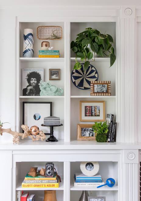
Divide each shelf section into groups of three elements — not three individual books or objects, but three compositional units. Each unit might be a stack of horizontal books, a vertical run of upright books, or a single decorative object. Grouping in threes creates visual rhythm: the eye moves from unit to unit in a way that feels dynamic rather than static.
Within each group, vary the height. A tall vase, a medium stack of horizontal books, and a low dish create a triangular visual composition within the shelf section. The triangle is the compositional unit that repeats with variation across the shelf length, creating rhythm without repetition.
Color Organization vs. Subject Organization: Which Serves Your Shelf
Organizing books by spine color — grouping warm tones together, cool tones together, neutrals together — creates a graphic, designed look that many people find visually appealing. It sacrifices retrievability (you can’t find a book by title unless you remember its color) and works best in shelves where the books are as much display as reference.
Subject organization maintains retrievability but requires additional compositional work — adding objects, varying orientation (some horizontal, some vertical), and leaving deliberate breathing room — to prevent the ‘library shelf’ look that reads as utilitarian rather than designed. A combination approach works for many households: subject-organized interior shelves that you access regularly, color or size-organized display shelves in visible positions.
The Art of Empty Space on Shelves
The instinct to fill every inch of shelf space is almost universal and almost always counterproductive. Empty space on a shelf — a gap between a book section and the next object, a shelf section with only one or two items — allows the eye to rest and gives the surrounding items room to be seen. Without this breathing room, the shelf becomes visual noise where individual elements lose their distinctiveness.
A useful benchmark: if every inch of your shelf is occupied, remove 25–30% of the items and redistribute what remains. The shelf will look more organized, more considered, and larger — not emptier. The items you removed can go into closed storage; only items that contribute to the composition need to be on display.
Objects That Work on Shelves and Those That Don’t
The objects that work best in shelf compositions share certain characteristics: they have clear form that’s readable at a distance, they don’t require close reading or attention to register as a visual element, and they provide textural or material contrast with the books and other objects around them. A simple ceramic vessel, a sculptural object, a natural element (stone, coral, a branch), or a framed photograph read well on shelves.
Objects that work less well: anything too small to register at shelf distance (tiny figurines, small bottles, single candles), anything too similar in form and texture to the books around it (paper items, magazines, documents), and anything that requires context to make sense as a display item. If you have to explain why something is on the shelf, it probably shouldn’t be there.